HOMAGE: I’m noticing a pattern here…
So my Screens ‘N’ Spokes print is an homage to Rob Jones’ Raconteurs posters. I’m realizing the homage is something I have been doing with some frequency, here’s the story:
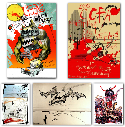
 I have done two homage prints of the great Ralph Steadman. The first was for a CCFA benefit print for Pearl Jam in 2006 coinciding with a show in Las Vegas, the design was just a wink at “Fear and Loathing in las Vegas” not necessarily a planned out homage to Steadman but I tried my best to nail the style. Then in 2008 for a poster for Queens of the Stone Age in Australia I chose the Steadman style specifically because I think it fits the band, plus I’ve never been to Australia so I think of it as some gnarly deep desert where crazy shit happens not unlike Las Vegas.

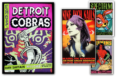
This here is an homage to Frank Kozik, a poster for the Detroit Cobras in 2008. This again came out of trying to find a style that fit the band AND as I recall at the time I was kind of in a crunch timewise to do this one and needed to pick a direction and go.
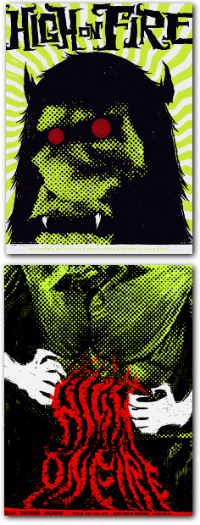
This is what I’d call a sequel. I had this High on Fire poster to do and I was looking through other HOF posters online and came to the realization that Zach Hobbs High on Fire is the best, there is none higher. So I said fuck it I’m just going to add to it, I’m gonna do the torso of that beast from Zach’s poster.
Sequels are always tough, I think I did a pretty good job but it’s probably no Godfather 2 or Empire Strikes Back…maybe it’s The Temple of Doom. Anyway, the colors match and I stayed within the rules of the design Zach established the his print. Both posters were printed in Seattle, Zach’s by Patent Pending(RIP) and mine at D&L(duh).
I think Zach liked it, I can’t remember.
I don’t really have anything else to say about this one but
I have space to fill in this margin
still….
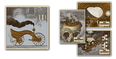
And bringing us up to the present we have my brand new Screen ‘N’ Spokes print 2009 which is in the style of a Rob Jones Raconteurs poster. Not that all of Rob’s posters for said band are in this style but most of them are, and in my opinion the best ones are.

This one from a design standpoint came out of left field. I was working up various concepts for a Decemberists poster I was working on a couple months ago, trying different things because they reject a small handful before approving anything, this bike was created in that vein. And it was collaged out of the same kind of source material that Rob does for the Raconteurs posters I’m referencing so I figured if the design is going that way I might as well just go all the way and make it a straight up Rob Jones homage and try and nail the style as close as possible.
At the same time I also had the Screens ‘N’ Spokes deadline coming up so it worked out. I didn’t want to just crap out a halftone image of a vintage bike over some floral pattern and cal it a day….not that there’s anything wrong with that.
Anyway, this print will be available soon.


No Comments